Code
import numpy
from statsmodels.graphics import gofplots
import scipyThis document provides more explanations for the 2D QQ plots conditioned on X values, with code (Python) and a few examples.
We start with a few imports and definitions of helper functions.
import numpy
from statsmodels.graphics import gofplots
import scipyimport matplotlib.pyplot as plt
from matplotlib.patches import RectangleReusing scipy.stats QQ plot utilities as much as possible.
def get_qqplot(probplot):
    return probplot.theoretical_quantiles, probplot.sample_quantiles
Introduce rotation and translation functions.
def rotate(x, y, theta):
    xrot = []
    yrot = []
    for u, v in zip(x, y):
        x_ = u * numpy.cos(theta) + v * numpy.sin(theta)
        y_ = v * numpy.cos(theta) - u * numpy.sin(theta)
        xrot.append(x_)
        yrot.append(y_)
return xrot, yrotdef translate(x,y, x0=0, y0=0):
return [_x + x0 for _x in x], [_y + y0 for _y in y]First, let’s make sure the QQ plot + transforms work as expected. Create fake empirical data by sampling from a standard normal distribution, and compare it with a reference centered uniform distribution in [-4, 4].
data = numpy.random.normal(0, 1, size=1000)
probplot = gofplots.ProbPlot(data, scipy.stats.uniform, a=0, loc=-4, scale=8)
x, y = get_qqplot(probplot)
Get the QQ plot (left), and perform a rotation (right) around the (0,0) point with a 45 degree angle.
fig, axs = plt.subplots(nrows=1, ncols=2)

axs[0].plot(x, y, ".b", label="qq")
xlim = axs[0].get_xlim()
axs[0].plot(xlim, xlim, "r-", label="x=y")
axs[0].set_title("QQ plot for one bin")
axs[1].plot(*rotate(x, y, -45 * numpy.pi / 180), ".b")
axs[1].plot(*rotate(xlim, xlim, -45 * numpy.pi / 180), "r-")
axs[1].set_xlim(1.414 * numpy.array(xlim))
axs[1].set_ylim(1.414 * numpy.array(xlim))
axs[1].set_title("QQ plot rotated by 45 degrees")
plt.show()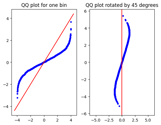
Notice the \(\sqrt{2}\) scaling that comes from rotating the \(y=x\) line by \(45\) degrees.
Now let’s do the 2D case. Consider that the data is generated by an underlying joint pdf $p(x,y). The idea is simple: first, we bin the 2D data into \(N\) equal size bins, where each bin is centered on \(\lbrace{x_b\rbrace}_{i=1}^N\). Then, we use the approximation \(p(y|x) = p(y|x_b)\) for all \(x\)’s in bin \(b\), ie. we do as, within the bin, all data came from the pure distribution \(p(y|x_b)\). For each bin, we can then get a QQ plot and rotate and shift it appropriately. Note that the reference distribution in the 2D case is not a joint distribution, but a sequence of conditional \(p(y|x_b)\) distributions.
We start by creating empirical data by sampling from a multivariate normal (centered, standard, uncorrelated). The reference distributions used for the QQ plot is the same uniform distribution as in the 1D case, N times.
data = numpy.random.multivariate_normal(
    [0, 0], cov=numpy.array([[1, 0], [0, 1]]), size=10 ** 4
)
X, Y = data.transpose(1, 0)
Again, some helper function to bin the 2D data.
# Not vectorized
def bin_bivariate_1d(X,Y,N = 20):
    minx = min(X)
    maxx = max(X)
    yy = [[]for i in range(0,N)]
    xx = [ minx + (i+1/2)*(maxx-minx)/N for i in range(0,N)]
    for i, v in enumerate(zip(X,Y)):
        x = v[0]
        y = v[1]
        index = int(numpy.floor((x-minx)/(maxx-minx + 1e-10)*N))
        yy[index].append(y)
    return xx, yy
Actually bin the data.
xx, yy = bin_bivariate_1d(X,Y)Now comes the main part of the code: for each bin, compute the qqplot, rotate it by \(45\) degrees and position it such that the origin of the QQ plot coïncides with \((x_b, \mu_{y,b})\), where \(\mu_{y,b}\) is the empirical mean of the data in the \(b\) bin.
def qqbinplot(xx, yy, ref_distrib, ax = None, **plot_kwargs):

    if ax is None:
        fig, ax = plt.subplots(nrows=1, ncols = 1)

    my = [numpy.mean(y) for y in yy]

    for n, (x,y) in enumerate(zip(xx,yy)):
        probplot = gofplots.ProbPlot(numpy.array(y), ref_distrib)
        qq_x, qq_y = get_qqplot(probplot)

        xlim = [numpy.min(qq_x), numpy.max(qq_x)]
        ax.plot(*translate(*rotate(xlim, xlim, -45 * numpy.pi / 180), x0 = x, y0 = numpy.mean(y)), "r-")
        ax.plot(*translate(*rotate(qq_x, qq_y, -45 * numpy.pi / 180), x0 = x, y0 = numpy.mean(y)), ".b", **plot_kwargs)

    return ax
A figure illustrates the procedure. On the top left, we have the sampled data. On the top right, the binned data, with empirical means in thick red dots. Below are the scaled and rotated QQ-plots with the uniform distributions as reference conditional distributions. A black rectangle indicates the viewpoint of the two smaller plots above.
Clearly, the data from the QQ-plots takes up more space than the actual scatter plot.
fig = plt.figure()
spec = fig.add_gridspec(3,2)
ax00 = fig.add_subplot(spec[0,0])
ax01 = fig.add_subplot(spec[0,1])
ax = fig.add_subplot(spec[1:,:])
ax00.scatter(X,Y, 1)
ax00.set_aspect("equal", "box")
for n, (x,y) in enumerate(zip(xx,yy)):
    m = numpy.mean(y)
    _x = [x for _y in y]
    ax01.scatter(_x, y, 1)
    ax01.scatter(x, m, 5, c='r')

ax01.set_aspect("equal", "box")
xlim = ax00.get_xlim()
ylim = ax00.get_ylim()
R00 = (xlim[0], ylim[0])
Rw = xlim[1] - xlim[0]
Rh = ylim[1] - ylim[0]
qqbinplot(xx,yy,scipy.stats.uniform(loc = -4, scale = 8)
, ax, markersize=2)
# ax.set_aspect("equal", "box")
ax.add_patch(Rectangle(R00, Rw, Rh, edgecolor = 'black', facecolor = 'none', lw = 4))

plt.tight_layout()
plt.show()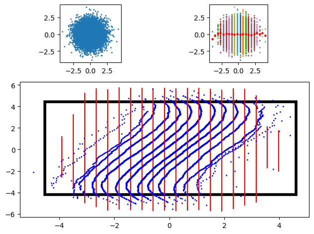
The previous code explains how the plots are built. But now, we’d like to see the plot in action. To do so, I again use some helper functions.
This one is a small tweak to the previous qqbinplot.
def qqbinplot(xx, yy, ref_distrib, ax=None, **plot_kwargs):

    if ax is None:
        fig, ax = plt.subplots(nrows=1, ncols=1)

    for n, (x, y) in enumerate(zip(xx, yy)):
        probplot = gofplots.ProbPlot(numpy.array(y), ref_distrib[n])
        qq_x, qq_y = get_qqplot(probplot)

        xlim = [numpy.min(qq_x), numpy.max(qq_x)]
        ax.plot(
            *translate(
                *rotate(xlim, xlim, -45 * numpy.pi / 180), x0=x, y0=numpy.mean(y)
            ),
            "r-",
        )
        ax.plot(
            *translate(
                *rotate(qq_x, qq_y, -45 * numpy.pi / 180), x0=x, y0=numpy.mean(y)
            ),
            ".b",
            **plot_kwargs,
        )

    return ax
This one is a wrapper around qqbinplot.
def QQplot_binned(
    data,
    reference_conditional_distributions,
    N=20,
    ax=None,
    **plot_kwargs,
):
    """

    * data should be an (X,Y) iterable. For example:

    data = numpy.random.multivariate_normal(
        [0, 0], cov=numpy.array([[1, 0], [0, 1]]), size=10 ** 4
    )
    X, Y = data.transpose(1, 0)

    * reference_conditional_distributions should be an iterable with N elements, where each element is the reference distribution conditional on a particular value of x

    For example, for a uniform distribution, we would have
    reference_conditional_distributions = [scipy.stats.uniform(loc=-4, scale=8) for i in range(N)]

    """

    xx, yy = bin_bivariate_1d(*data, N=N)
    reference_conditional_distributions
    return qqbinplot(xx, yy, reference_conditional_distributions, ax=ax, **plot_kwargs)
This one plots the QQ-bin plot and also a few reference and empirical conditional distributions, for illustration.
def plot_qq_with_conditionals(
    data, reference_conditional_distributions, N=20, cropped=True, **plot_kwargs
):
    fig = plt.figure()
    spec = fig.add_gridspec(3, 3)
    axmain = fig.add_subplot(spec[:2, :2])
    ax1 = fig.add_subplot(spec[0, 2])
    ax2 = fig.add_subplot(spec[1, 2])
    ax3 = fig.add_subplot(spec[2, 0])
    ax4 = fig.add_subplot(spec[2, 1])
    ax5 = fig.add_subplot(spec[2, 2])
    ax_dict = {"ax1": ax1, "ax2": ax2, "ax3": ax3, "ax4": ax4, "ax5": ax5}
    xx, yy = bin_bivariate_1d(*data, N=N)

    try:
        x_min, x_max = numpy.min(xx), numpy.max(xx)
        y_min, y_max = numpy.min([numpy.min(y) for y in yy]), numpy.max(
            [numpy.max(y) for y in yy]
        )
    except ValueError: # had a value error once, but can't seem to reproduce. Probably in case of empty bin.
        print(numpy.min(yy))
        exit()

    margin_plots = plot_kwargs.pop("margin_plots", (0.2,0.2))


    QQplot_binned(
        data,
        reference_conditional_distributions,
        N=20,
        ax=axmain,
        **plot_kwargs,
    )

    # does not seem to work, quick hack instead
    # axmain.set_xlim((x_min, x_max))
    # axmain.set_ylim((y_min, y_max))
    # axmain.margins(*margin_plots)
    axmain.set_xlim((-5, 5))
    axmain.set_ylim((-5, 5))
    ####         end hack


    index = [N / 2 - 2 * N / 6, N / 2 - N / 6, N / 2, N / 2 + N / 6, N / 2 + 2 * N / 6]
    index = [int(numpy.round(i)) for i in index]

    for n, i in enumerate(index):
        x = numpy.linspace(
            reference_conditional_distributions[i].ppf(0.01),
            reference_conditional_distributions[i].ppf(0.99),
            100,
        )
        ax_dict.get("ax" + str(n + 1)).plot(
            x,
            reference_conditional_distributions[i].pdf(x),
            "r-",
            label=f"reference distribution | x = {xx[i]:.3f}",
        )
        ax_dict.get("ax" + str(n + 1)).hist(yy[i], density=True)
        ax_dict.get("ax" + str(n + 1)).set_title(f'cond. pdf for x={xx[i]:.2f}')
Now for the illustrations (I again use a 2D centered uncorrelated standard Gaussian).
First, using the ``correct’’ conditional distribution:
# Normal with same parameters
plot_qq_with_conditionals(
    data.transpose(1, 0),
    [scipy.stats.norm(loc=0, scale=1) for j in range(20)],
    N=20,
    markersize=2,
    margin_plots = [1,1],
)
plt.tight_layout()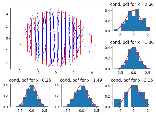
Then a reference conditional with higher variance:
plot_qq_with_conditionals(
    data.transpose(1, 0),
    [scipy.stats.norm(loc=0, scale=1.5) for j in range(20)],
    N=20,
    markersize=2,
)
plt.tight_layout()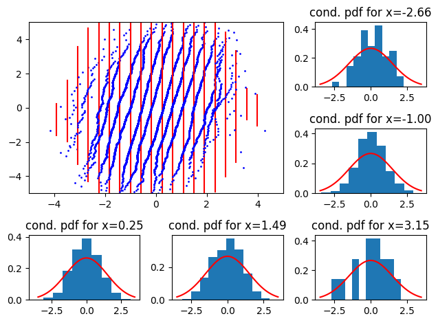
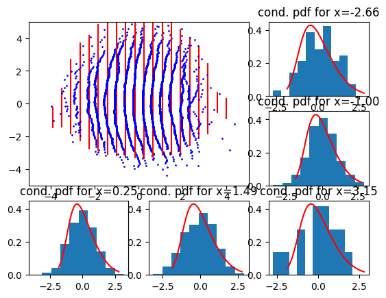
and smaller variance
plot_qq_with_conditionals(
    data.transpose(1, 0),
    [scipy.stats.norm(loc=0, scale=1 / 2) for j in range(20)],
    N=20,
    markersize=2,
)
plt.tight_layout()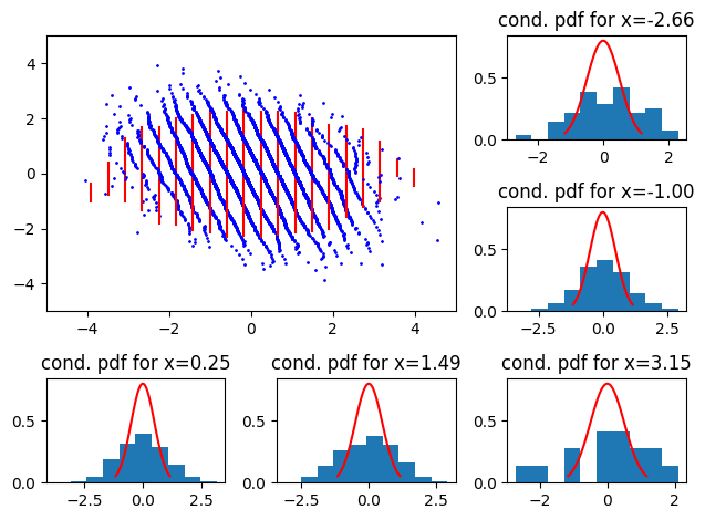
So, we see scaling issues with straight, oriented 2D QQ-plots. North west (resp. north east) indicates that the reference conditional has a smaller (resp larger) variance than the empirical.
Now, with negative mean:
plot_qq_with_conditionals(
    data.transpose(1, 0),
    [scipy.stats.norm(loc=-1, scale=1) for j in range(20)],
    N=20,
    markersize=2,
)
plt.tight_layout()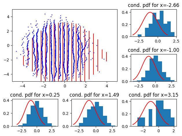
and with positive mean
plot_qq_with_conditionals(
    data.transpose(1, 0),
    [scipy.stats.norm(loc=1, scale=1) for j in range(20)],
    N=20,
    markersize=2,
)
plt.tight_layout()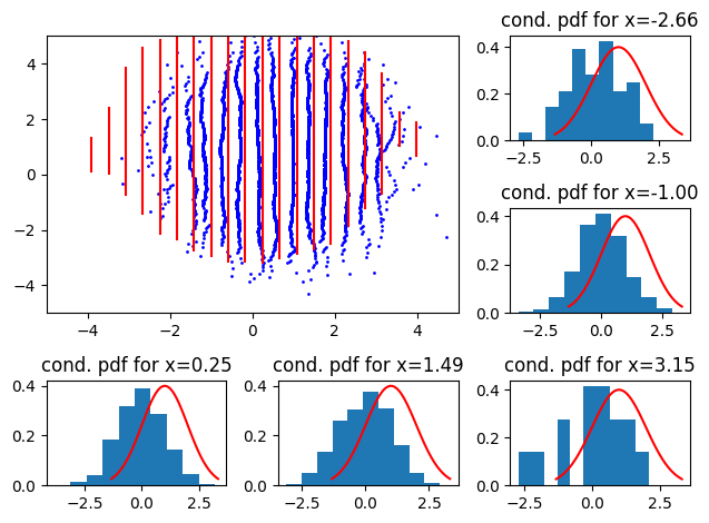
Here, we see the distributions shift left or right.
Now, what if the conditional reference distribution is a function of \(x\)? First, with a conditional where the variance increases with \(x\): We use the distribution \(p(y|x) = \mathcal{N}(0, (0.5 + 0.05j)^2), \quad j \in [0,1...,19]\)
plot_qq_with_conditionals(
    data.transpose(1, 0),
    [scipy.stats.norm(loc=0, scale=0.5 + 0.05 * j) for j in range(20)],
    N=20,
    markersize=2,
)
plt.tight_layout()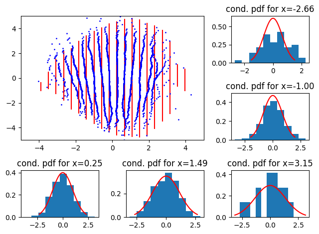
Now, for the case where variance decreases with \(x\), we use the distribution \(p(y|x) = \mathcal{N}(0, (1.5 - 0.05 * j)^2), \quad j \in [0,1...,19]\)
plot_qq_with_conditionals(
    data.transpose(1, 0),
    [scipy.stats.norm(loc=0, scale=1.5 - 0.05 * j) for j in range(20)],
    N=20,
    markersize=2,
)
plt.tight_layout()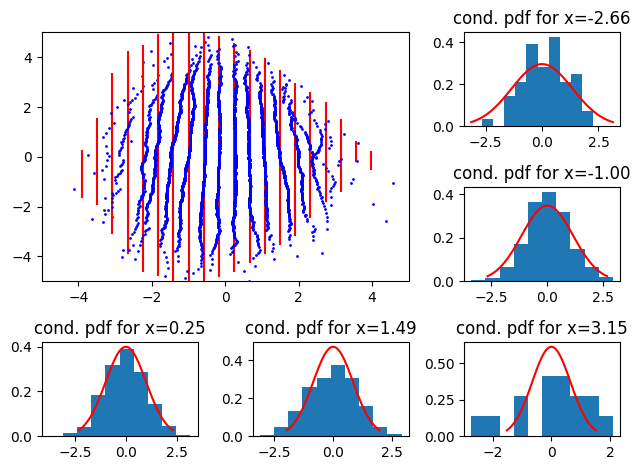
Here, we see that the 2D QQ-plot “closes” or “opens” going from bottom to top.
The next visualisation is about skewness. For this, we use a skew normal distribution, where we compute the parameters such that the location and scale parameters of the skew normal distribution are equal to that of the ones used for sampling the data. For this, we introduce another helper function.
def scale_skew(a, mu=0, stdev=1):
    delta = a / numpy.sqrt(1 + a ** 2)
    scale = numpy.sqrt(stdev ** 2 / (1 - 2 * delta ** 2 / numpy.pi))
    loc = mu - scale * (delta) * numpy.sqrt(2 / numpy.pi)
    return loc, scale
Now for a right (positive) skew, we get
loc, scale = scale_skew(3)


plot_qq_with_conditionals(
    data.transpose(1, 0),
    [
        scipy.stats.skewnorm(
            3,
            loc=loc,
            scale=scale,
        )
        for j in range(20)
    ],
    N=20,
    markersize=2,
)
and for a negative skew we get
loc, scale = scale_skew(-3)

plot_qq_with_conditionals(
    data.transpose(1, 0),
    [
        scipy.stats.skewnorm(
            -3,
            loc=loc,
            scale=scale,
        )
        for j in range(20)
    ],
    N=20,
    markersize=2,
)
plt.tight_layout()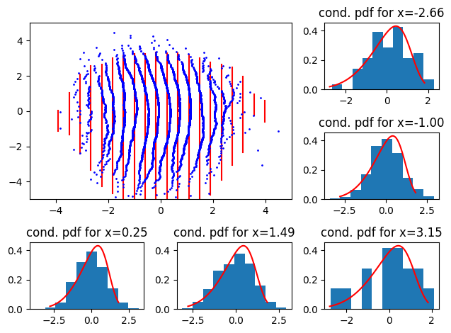
We see that a skewness discrepancy shows off as a “bulge” in either left or right direction.
Now, what if the empirical data is correlated? To illustrate, let’s consider a centered standard bivariate correlated (\(\rho = 0.5\)) normal distribution.
data = numpy.random.multivariate_normal(
    [0, 0], cov=numpy.array([[1, 0.5], [0.5, 1]]), size=10 ** 4
)plot_qq_with_conditionals(
data.transpose(1, 0),
[scipy.stats.norm(loc=0, scale=1) for j in range(20)],
N=20,
markersize=2,
)
plt.tight_layout()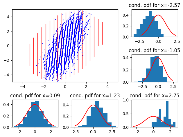
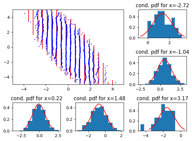
and its negatively correlated counterpart (\(\rho = -0.5\))
data = numpy.random.multivariate_normal(
[0, 0], cov=numpy.array([[1, -0.5], [-0.5, 1]]), size=10 ** 4
)
plot_qq_with_conditionals(
    data.transpose(1, 0),
    [scipy.stats.norm(loc=0, scale=1) for j in range(20)],
    N=20,
    markersize=2,
)
plt.tight_layout()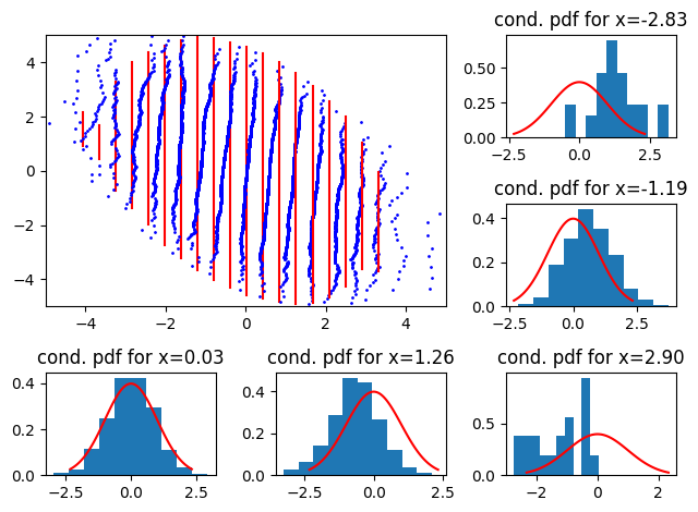
I am not sure why we don’t get a plot symetric to the previous one.
We can also compare with the theoretical conditionals, which are also Gaussians with mean \(\mu_x\) and covariance matrices \(\Sigma_x\)
\[\begin{align} \mu_x = \mu_1 + \Sigma_{12}\Sigma^{-1}_{22}(x - \mu_2) \\ \Sigma_x = \Sigma_{11} - \Sigma_{12}\Sigma^{-1}_{22}\Sigma_{21} \end{align}\]
mu_1, mu_2 = 0, 0
Sigma11, Sigma12, Sigma22 = 1, -0.5, 1
data = numpy.random.multivariate_normal(
    [mu_1, mu_2], cov=numpy.array([[Sigma11,  Sigma12], [Sigma12, Sigma22]]), size=10 ** 4
)
xx, yy = bin_bivariate_1d(*data.transpose(1, 0), N=20) # Just to get xx

mu_x = [mu_1 + Sigma12/Sigma22*(x-mu_2) for x in xx]
Sigma_x = [Sigma11 - Sigma12**2/Sigma22 for x in xx]

reference_conditionals = [scipy.stats.norm(loc = mux, scale = numpy.sqrt(sigmax)) for mux, sigmax in zip(mu_x, Sigma_x)]
plot_qq_with_conditionals(
    data.transpose(1, 0),
    reference_conditionals,
    N=20,
    markersize=2,
)
plt.tight_layout()